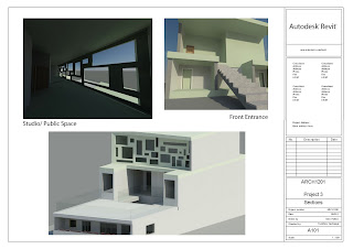
For this project, the aim was to create a space which had a strong relationship between house, garden and art, which led me to the idea of framing. The design aims to frame the city view, the garden and the art, through a variety of architectural devices. The first instance of this concept is seen at the front entrance of the house where the door seems to be framed by the structural design of the building. Once the occupant enters the house, they are immediately confronted with a huge window overlooking the city which is framed by the long hallway and the rectangular window directly in the path. The focus is then placed on the garden, where the occupant is directed to focus on the huge garden as they make their way down the stairs.
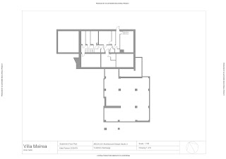
The garden was placed in between the two houses to act as the connecting point, uniting the two occupants. This was inspired by the Villa Mairea in the way the house is centred around the garden, placing a great deal of emphasis on it, especially in the way it determines the path of circulation. The houses relationship is also demonstrated in the way they are laid out. The house for the grandmother has a much bigger kitchen and dining room, whereas the art dealer only has the bare necessities. This is representative of their inter-dependant relationship, and also their individual lifestyles, as the art dealer has more of an interest in the art, spending more time in the studio and rooftop terrace.
The facade is made with warn copper, to try and fit in with this area, with an aged look, without conforming to the old Victorian styles, but also being sympathetic to this historic area.
ARCH1201- Architectural Design Studio 3
Kate Palmer
Monday, June 13, 2011
Monday, May 9, 2011
Project 2
Circulation
This plan provides a summary of Aaltos architectural stategy in terms of circulation. The most important device he has used, is the orientation which takes advantage of the sun, in order to map out certain narratives. This is shown through the shadwo diagram and the arrows which point out the direction of the sun. This map also highlights the hierarchy of spaces, which is used as part of the social narrative reflecting Finish social values, where someone would be invited into a house for social interaction. They would start in the living room for a drink (largest area), and then closer friends would then be invited in the dining area (smaller space), after which, the closest guests would be invited into the sauna (the smallest space).

Aaltos strategy for circulation is to encourage people to go further. He uses a series of devices to do this, which I have graphically represtned in this model, in a series of rendered perpectives. It incldues the entrance, where the timber columns are strategically placed, in order to guide the visitors into the house. This is followed by the entrance room, whhere the curved partition points you to move into the living space. From here, more timber columns are utlised to further guide the journey into the dining room, where the asymmetric shape of the ceiling points the moving direction towards the door, which connects to the extneral canopy leading to the sauna. These architectural devices are used to imply a specific narrative which reflects a traditional Finish social occasion, where a visitor would be welcomed into a home.


This series of perspectives represents Aalto’s light strategy, which utilizes the movements of the sun to imply a narrative of circulation throughout the house. I have included three images, which capture certain moments in the house, which are influenced by the presence of the sun.

Materiality
Aalto saw things in terms of patterns, so to map out the materiality in the house, I used a floor plan divided by patterns to represent the variation of materials. From this distinction you can see how Aslot has cleverly used materials to imply particular uses for each space. For example he has used plenty of timber in the living room to give a warm, home-like feeling, whereas in the service parts of the house small tiles are utilised.

This extruded perspective of the facde depcits the strong relationship between materials. The main materials used include timber and brick render accented with stone, which are all layered in this image, showing the richness of the materiality.

Aalto’s attitude towards materials was based on a gret respect for nature and an urge to embrace this through materiality. He used the materials as a device to connect the architecture with the landscape. I represented this through a model of a space in the house which most clearly demonstrates this idea. The contrast between wood, stone, tiles, glass and brick render emphasises the diversity of materials and shows the way in which ee tried to ‘find a simple and honest way to use wood.’

Relationship between interior and exterior
One of the most interesting things about this building is it’s layers; overlapping of light and shade, tree foliage and trunks, bushes, colours and mateials, reflection and texture and the building itself. Everything overlaps to confuse the boundaries. This represntation shows the relationship in the way that when you take one layer away tt reduces the depth and interest. Without it the building looks like a box.

This extruded section is intended to portray the feeling of wandering through a forest in which spaces seem to form and re-form around you, which is a dominant feeling in this building.

This model which is made out of perspex, is a representation of the transparency of the house. It shows how Aalto has blurred the boundaries between interior and exterior particuarly through the extensive use of glazing which allows the occupants to keep a close sense of being in the forest. In contrast, the l-shape of the house defines a clear boundary between the forest and the house. This L-shape also appears to hug the nature, making the courtyard naturally extend to the landscape.


This plan provides a summary of Aaltos architectural stategy in terms of circulation. The most important device he has used, is the orientation which takes advantage of the sun, in order to map out certain narratives. This is shown through the shadwo diagram and the arrows which point out the direction of the sun. This map also highlights the hierarchy of spaces, which is used as part of the social narrative reflecting Finish social values, where someone would be invited into a house for social interaction. They would start in the living room for a drink (largest area), and then closer friends would then be invited in the dining area (smaller space), after which, the closest guests would be invited into the sauna (the smallest space).

Aaltos strategy for circulation is to encourage people to go further. He uses a series of devices to do this, which I have graphically represtned in this model, in a series of rendered perpectives. It incldues the entrance, where the timber columns are strategically placed, in order to guide the visitors into the house. This is followed by the entrance room, whhere the curved partition points you to move into the living space. From here, more timber columns are utlised to further guide the journey into the dining room, where the asymmetric shape of the ceiling points the moving direction towards the door, which connects to the extneral canopy leading to the sauna. These architectural devices are used to imply a specific narrative which reflects a traditional Finish social occasion, where a visitor would be welcomed into a home.


This series of perspectives represents Aalto’s light strategy, which utilizes the movements of the sun to imply a narrative of circulation throughout the house. I have included three images, which capture certain moments in the house, which are influenced by the presence of the sun.

Materiality
Aalto saw things in terms of patterns, so to map out the materiality in the house, I used a floor plan divided by patterns to represent the variation of materials. From this distinction you can see how Aslot has cleverly used materials to imply particular uses for each space. For example he has used plenty of timber in the living room to give a warm, home-like feeling, whereas in the service parts of the house small tiles are utilised.

This extruded perspective of the facde depcits the strong relationship between materials. The main materials used include timber and brick render accented with stone, which are all layered in this image, showing the richness of the materiality.

Aalto’s attitude towards materials was based on a gret respect for nature and an urge to embrace this through materiality. He used the materials as a device to connect the architecture with the landscape. I represented this through a model of a space in the house which most clearly demonstrates this idea. The contrast between wood, stone, tiles, glass and brick render emphasises the diversity of materials and shows the way in which ee tried to ‘find a simple and honest way to use wood.’

Relationship between interior and exterior
One of the most interesting things about this building is it’s layers; overlapping of light and shade, tree foliage and trunks, bushes, colours and mateials, reflection and texture and the building itself. Everything overlaps to confuse the boundaries. This represntation shows the relationship in the way that when you take one layer away tt reduces the depth and interest. Without it the building looks like a box.

This extruded section is intended to portray the feeling of wandering through a forest in which spaces seem to form and re-form around you, which is a dominant feeling in this building.

This model which is made out of perspex, is a representation of the transparency of the house. It shows how Aalto has blurred the boundaries between interior and exterior particuarly through the extensive use of glazing which allows the occupants to keep a close sense of being in the forest. In contrast, the l-shape of the house defines a clear boundary between the forest and the house. This L-shape also appears to hug the nature, making the courtyard naturally extend to the landscape.


Wednesday, April 6, 2011
Final Model- Villa Mairea
This is our groups model of the Villa Mairea at scale 1:100. We used balsa wood and white card. We tried to represent the duality of natural and man-made materials in the model by using the white card to represent all artificial materials such as brick, render and tiles and the more natural materials such as timber and stone, by using balsa wood. This allowed us to see how cleverly Aalto interweaves the two in order to achieve a strong relationship with the natural environment but also to narrate the social and domestic uses of the house. We also tried to highlight this relationshop through our representation of the timber columns and the trees of the surrounding forest which we made identical. This is to emphasise Aalto's naturalistic approach and the way in which he tried to blur the boundary between the natural landscape and this man-made.


Subscribe to:
Comments (Atom)


